Had you ever stuggled with finding a way to easily develop components in isolation without having to create a new environment each time, or trying to replicate a bug in one of the components you developed? Well, in recent years Storybook has arisen to help us do just that.
Storybook
Storybook is an open source tool at version 5.2 as I write this, and its purpose is to give the developer the ability to create UI components in isolation for all the popular frameworks like React, Vue, Angular and more so lets start our exploration.
For the purpose of this article I will be using ReactJS as the chosen framework to showcase storybook.
In case you just want to grab the code, you can do so here
Installation
Create directory and package.json
mkdir storybook-starter && cd storybook-start && npm init -yInstall storybook
npx -p @storybook/cli sb init --type reactInstallation
After the installations are done, you should have a folder structure like the following
storybook-starter
 ├─> .storybook
 │   ├── addons.js
 │   └── config.js
 ├── package-lock.json
 ├── package.json
 ├─> stories
     ├── 0-Welcome.stories.js
     └── 1-Button.stories.js
Run storybook
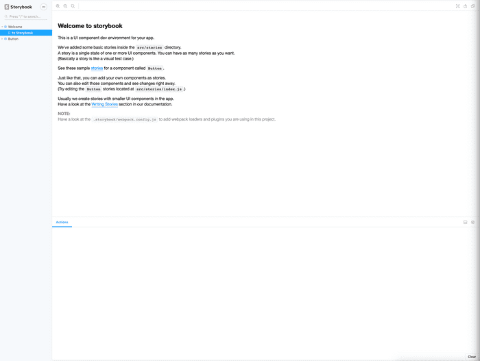
npm run storybookYou should be able to observe the following
As you can see, by default storybook creates two sample stories. Stories are what you would refer to as component showrooms.
Each story conveys a story, and usually its for show casing a specific component and its various states/use cases.
Exploration
Exploring the directory structure
We have two major points of contact with storybook. The .storybook folder and the .stories.js files. In layman terms anything that has to do with configuration before/while starting Storybook goes into the .storybook folder.
Examples include, adding addons, extending default webpack config, adding presets etc.
The second point of contact with Storybook are the files ending in .stories.js.
If you look under .storybook/config.js you will find the following:
// .storybook/config.js
import { configure } from '@storybook/react';

// automatically import all files ending in *.stories.js
configure(require.context('../stories', true, /\.stories\.js$/), module);
The configure function is used to determine what folder(s) to watch for stories and in what extension they end. The default is looking in the stories folder one level above for files ending in .stories.js. You can easily extend this to include .story and .jsx like this
configure(require.context('../stories', true, /\.(stories|story)\.(js|jsx)$/), module);Exploring installed addons
By default Storybook installs two addons
// .storybook/addons.js
import '@storybook/addon-actions/register';
import '@storybook/addon-links/register';
Actions addon
The actions addon which is used to display event handler data e.g on click when you an event it is displayed in the addons bar like so (more info in the exploring sample stories section)

Links Addon
The links addon can be used to link different stories together so that you can present to your manager your components linked together with a prototype kind of feel.
Exploring the sample stories
// 1-Button.stories.js
import React from 'react'
import { action } from '@storybook/addon-actions'
import { Button } from '@storybook/react/demo'

export default {
  title: 'Button'
}

export const text = () => (
  <Button onClick={action('clicked')}>Hello Button</Button>
)

export const emoji = () => (
  <Button onClick={action('clicked')}>
    <span role='img' aria-label='so cool'>
      😀 😎 👍 💯
    </span>
  </Button>
)
So, what do we have in the example above? CSF basically requires a default export with at least a title attribute which means the story title. For each substory you just export different constants and they automagically get picked up by Storybook as substories of the story Button in this case. Whats cool about it, even if you write weird naming syntax like some_custom_NAME it will convert to Some Custom NAME when displayed in Storybook.
So basically this should all be familiar if you have ever written React before. You just write normal React components like you are used to in isolation.
Action addon
In the example code above you might have noticed the import statement and its usage
import { action } from '@storybook/addon-actions'

...
<Button onClick={action('clicked')}>Hello Button</Button>
...
This is one of the default addons that usually come if you run the CLI command to install Storybook. What it does is display received data by event handlers (read more)
If you have followed any other tutorials in the past, you might notice that the syntax is different. Since v5.2 storybook team suggests writing your components in Component Story Format (CSF) instead of using the
storiesOfAPI. It is much cleaner and thus easier to read and work with.
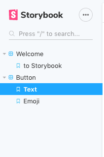
At the end this is what the story tree looks when rendered:
Making webpack overrides
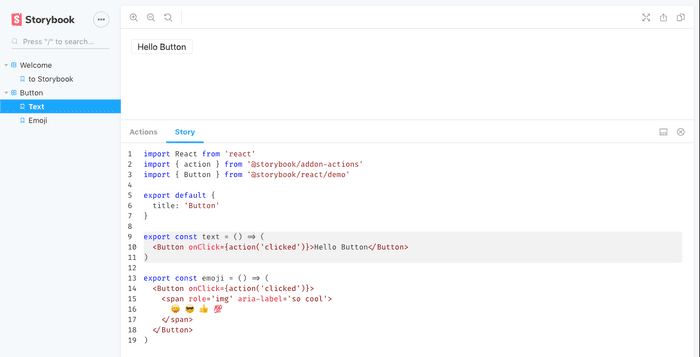
So, underneath Storybook uses webpack to find the stories and parse them. But if for whatever reason you would like to extend its functionality you might be left wondering where you would put that functionality. As an example we are going to setup the storysource addon which basically shows the source of the story as the name suggests in the addons bar.
Install Storysource addon
npm i -D @storybook/addon-storysourceRegister the addon
Usually almost all addons needs to be registered first in this special file called addons.js
// .storybook/addons.js
import '@storybook/addon-actions/register';
import '@storybook/addon-links/register';
import '@storybook/addon-storysource/register'; // new-line
Extend webpack config
This particular addon requires to add a new loader to the webpack config, and to do that we need to create a file named webpack.config.js under .storybook with the following:
// .storybook/webpack.config.js
module.exports = function({ config }) {
  config.module.rules.push({
    test: /\.stories\.jsx?$/,
    loaders: [require.resolve('@storybook/source-loader')],
    enforce: 'pre',
  });

  return config;
};
Remember to also add here the same rule for what files to check as in the
config.jsfile. (e.g/\.stories\.jsx?$/)
Run storybook
npm run storybookif everything went well, you should now have a new tab in the addons bar with the source code of the story.
Next steps
Wheww we learned some good stuff (i hope) but these barely scratch the surface what Storybook can do. There are other pretty cool addons like knobs which autogenerates an interface so you can easily change the passed props to a component from the story itself and see the results on the fly. Or a documentation addon like surprise, surprise @storybook/addon-docs. You can even do testing, which you can find more info here.
Until next time people!
PS. What do you love most about Storybook so far?


